Embarking on the exciting journey of revitalizing an iconic snack brand, I embraced the challenge of rebranding Cheetos in this dynamic project. Inspired by the inherent playfulness and vibrant hues of the snack itself, I set out to reimagine its visual identity and market appeal.
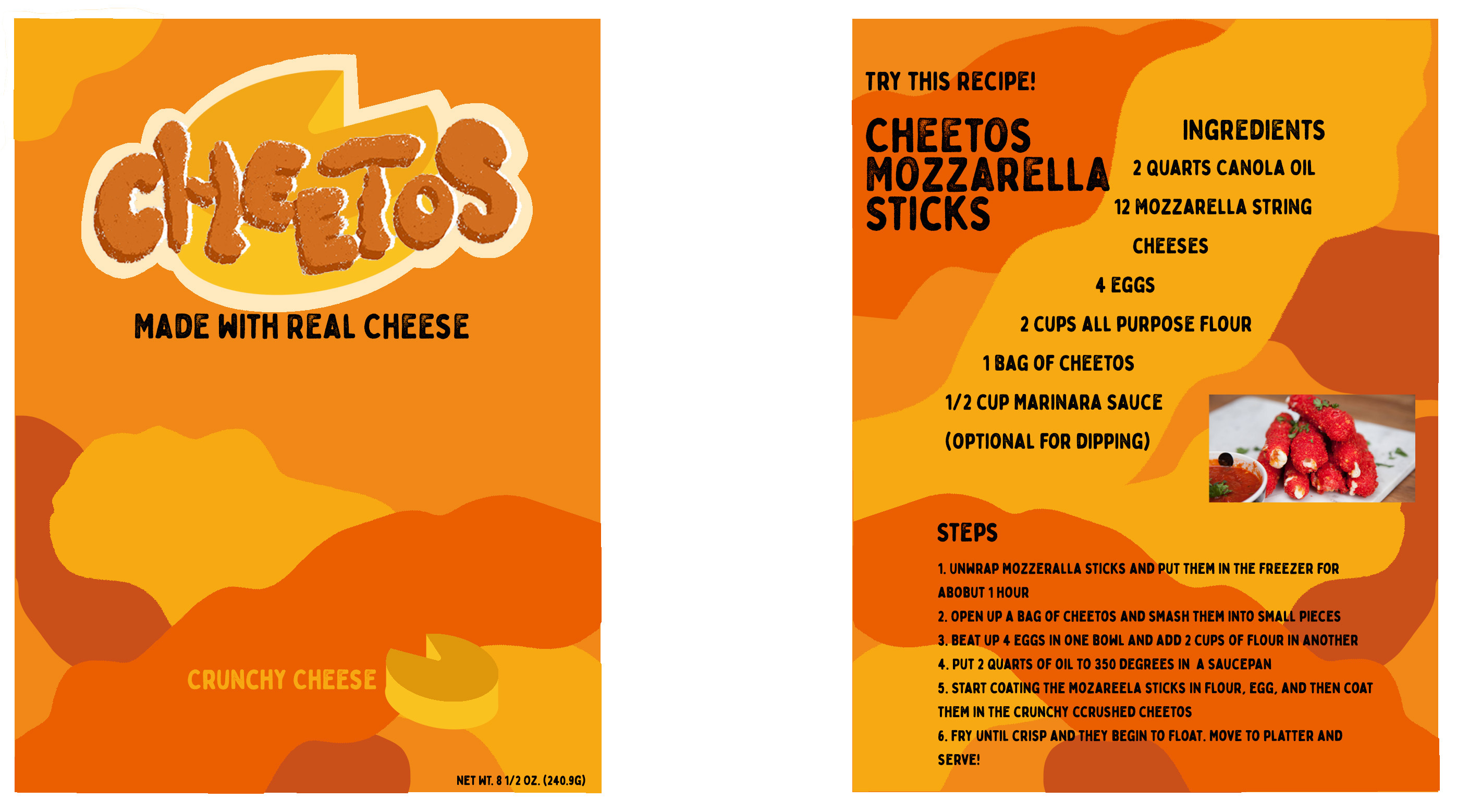
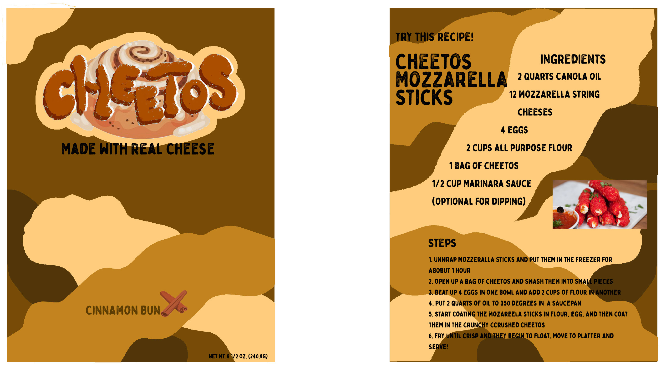
The color palette, reminiscent of the snack's vivid tones, was thoughtfully integrated into a cheesy typography and lively graphics. This infusion of color and design elements not only paid homage to the brand's roots but also injected a fresh and contemporary vibe.
A distinctive feature of this rebranding effort was the incorporation of prints of actual Cheetos, dynamically changing color based on each flavor. This touch creates a visual language that speaks to both the existing fanbase and captures the attention of a younger, diverse audience. The result was a harmonious blend of familiarity and novelty, ensuring the brand's continued relevance in the ever-evolving market.
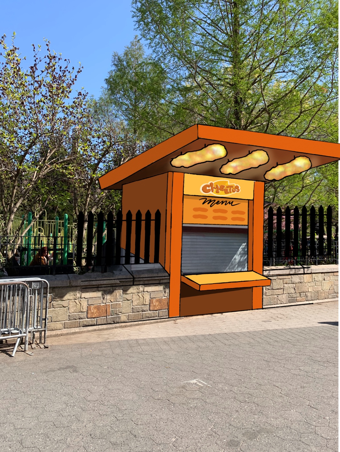
The comprehensive scope of this project included the development of a toolkit, new logo, designed front and back packaging for two distinct flavors, and a visually captivating design for a pop-up event. Each component was meticulously crafted to combine with the overarching theme of creating a cohesive and engaging brand narrative. This rebranding venture for Cheetos aims at breathing new life into a beloved snack icon, setting the stage for its continued success and resonance with a diverse audience.
Toolkit
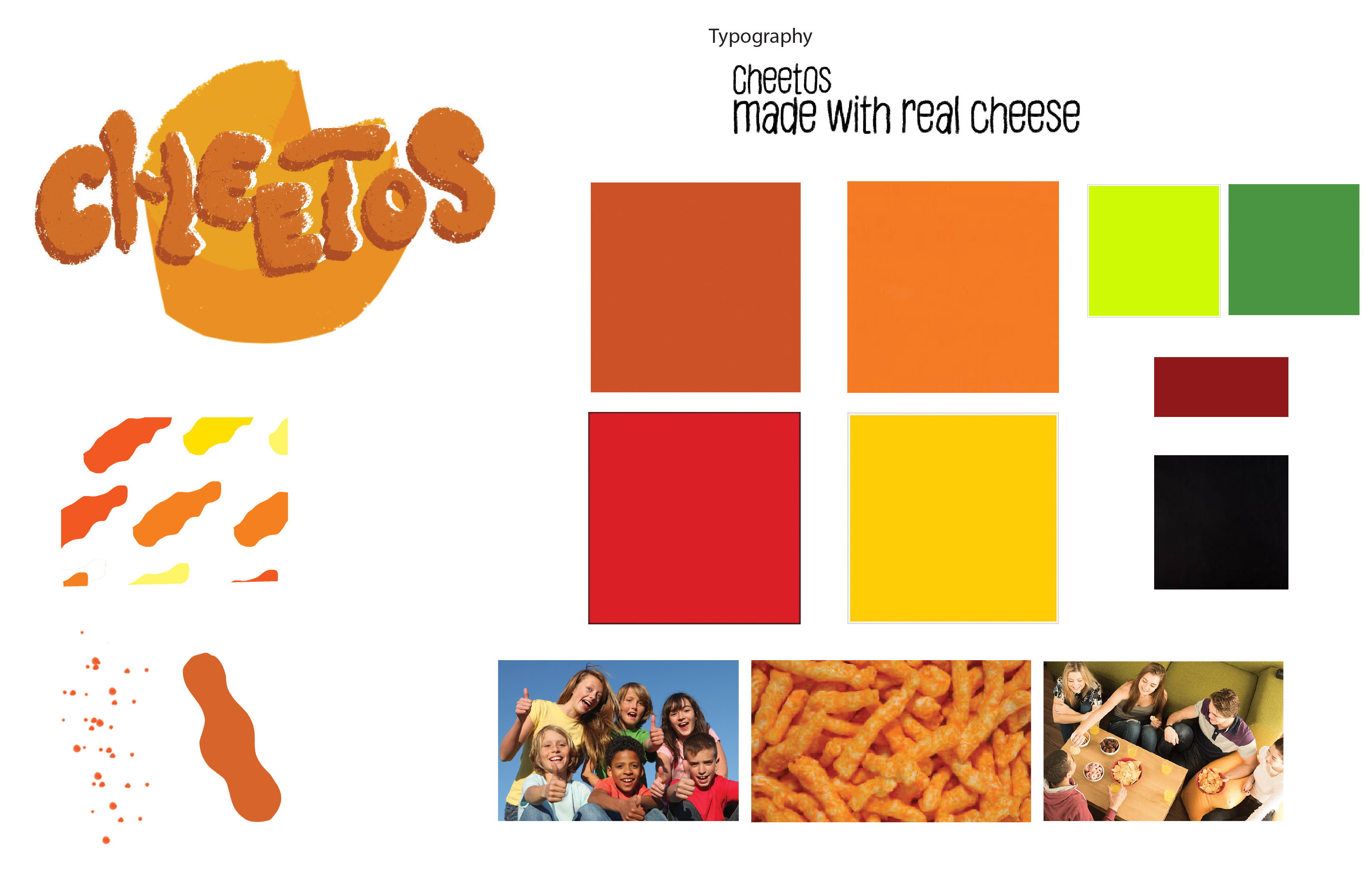
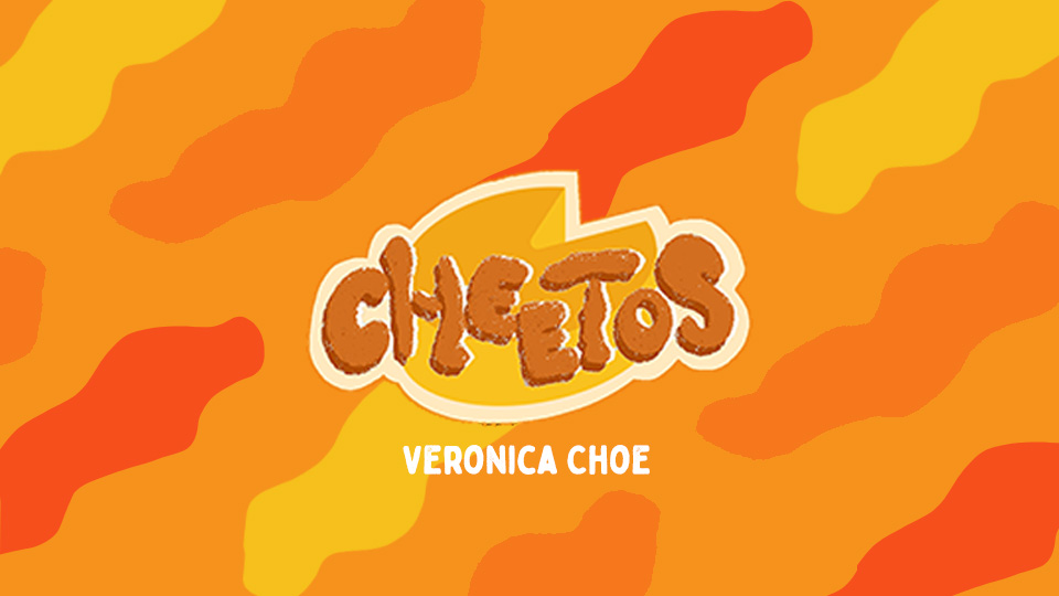
Logo
Front and Back of Packaging